Great divide emerges over new Tennessee logo
[gtxvideo vid=”0j9Loaw8″ playlist=”” pid=”OTSe9U1y” thumb=”http://player.gtxcel.com/thumbs/0j9Loaw8.jpg” vtitle=”TN New LOGO PKG”]
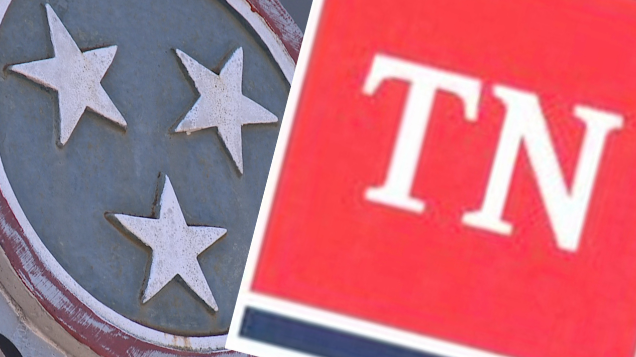
JACKSON, Tenn. — A big change in a logo that identifies the State of Tennessee has many residents up in arms. Most are saying a new logo, meant to unify, is only creating a bigger divide. It is hard to go anywhere in the Volunteer State without seeing our iconic tri-star logo. But as the governor’s office is set to unveil a new simplistic design at a hefty price tag, many are asking, what’s the point? “I think that nine out of 10 people would tell you they like it just like it is,” local historian Harbert Alexander said. It is a change in branding in the state logo from our iconic three stars to a little red square, leaving many not impressed. “It’s what we know — it’s the Tennessee logo,” resident Chad Smith said. “Everyone knows it and it’s perfectly fine. I don’t see any reason to fix it if it isn’t broken.” The new logo is simple — the letters “TN” in plain type on a red square over a blue bar. The governor’s office says they’re trying to unify state departments. The design cost the state $46,000. “We had a perfectly nice one already,” Smith said. “I mean, it is a pretty little picture, but I would have done it for $50.” But why the change in the first place? Alexander says for more than 100 years, West, Middle and East Tennessee, although different, have been connected by the unofficial tri-star logo. “We are unique,” Alexander said. “We really have three separate states that unify into one great state.” And that is why many residents and even politicians have taken to social media showing outrage at the design and its cost. “This is going to cost a fortune for us to implement,” Tennessee State Representative Andy Holt said. “Every department is supposed to re-implement this new logo.” Many said although we may see the little red square start popping up, the Tennessee tri-star will live on. “People rally behind symbols, they rally behind flags,” Alexander said. “But this new one — I don’t see that happening.” The Nashville firm that designed the logo has a strong resume full of other popular brands including the Tennessee Titans and Tractor Supply Company. The governor’s office said it will not require all state agencies to buy new stationery with the new logo.